A Living Room Worth Living In
In this apartment, this is the first time that we have a separate living space and bedroom space, which has been something new and fun to navigate for us, especially because now there is no bed in our living room and vice versa. The fact that we also moved during a pandemic and quarantine, meant that we were going to be spending A LOT of time at home and we wanted to make this living room space the most comfortable and inviting. It is also the first room off the entryway and opens you to the rest of the house, so it was important that it was comfortable looking as well. The living room is also truly the only space in the apartment that I gave KC full design control. Naturally, I had my input and added things to the space, but it was mainly all him!
THE FURNITURE
OUR COUCH
Most of the furniture that is in this room was furniture that we had from all of our other apartments with some new additions and using the furniture in a new way. Some we bought new and some we just re-purposed.
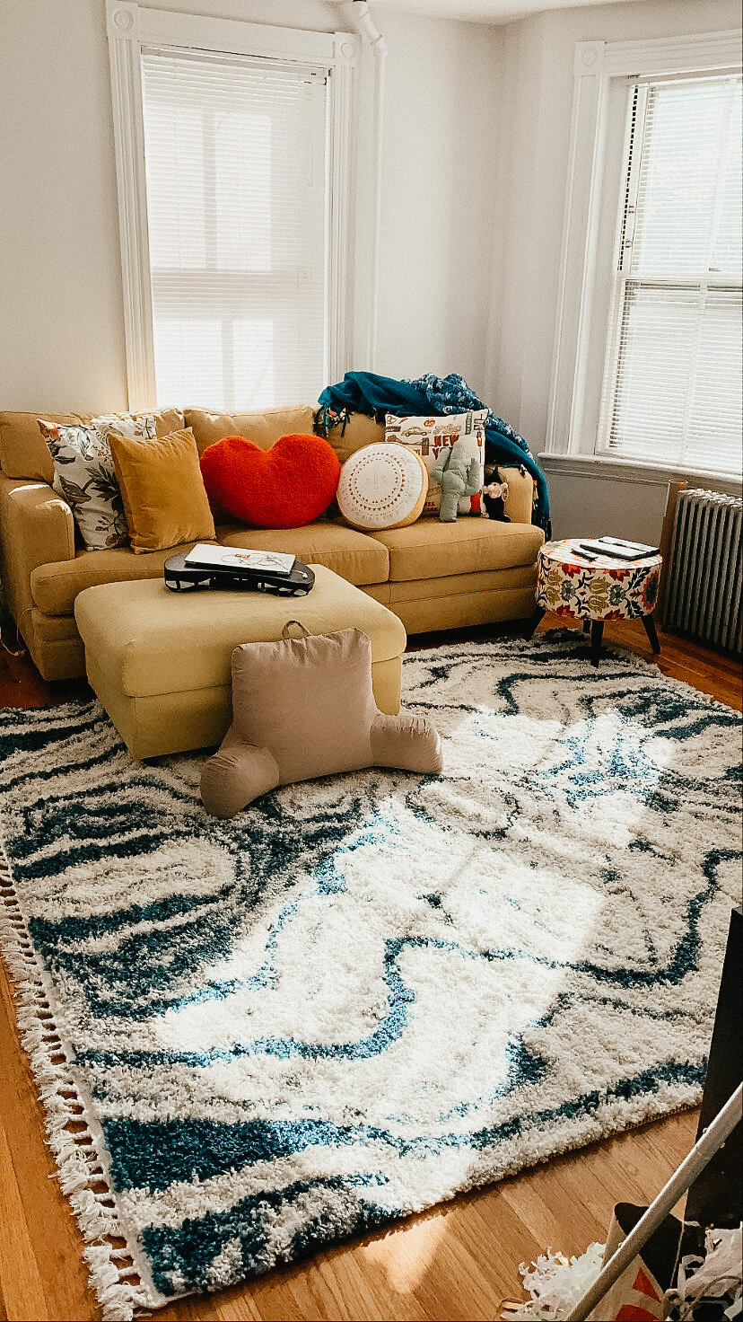
To start it all off, we have a pretty large yellow couch with a semi matching ottoman. We bought the couch from Bob’s, yes Bob’s Discount Furniture.The one with all the weird ads, and I think we bought it off the outlet. It was a total find and this couch is literally amazing. It is so comfortable and soft and also always looks perfect all the time.
Last year, I found an ottoman that was almost perfectly matching on IKEA and it was a storage ottoman! I have so many blankets and extra pillows and having the space to put them, to make the space look neat is fantastic. Having a storage ottoman really is the best of both worlds, I cannot stress it enough to purchase one. When we put them together in the living room space, they look as if they were one set, and it all works the best for us. We spend a lot of time on this couch.
SOME RANDOM FURNITURE
We also have a small movable ottoman from Target that is multi colored. It is often off to the side because it moves a lot and serves a lot of the time as a side table. So, I sometimes use it as a crochet table or even just a place to put my water cup or some snacks. I know that is not exactly what this ottoman was built for, but it is perfect for all these little things we use it for.
We have a small storage table that we keep some craft supplies, for a current craft that I am normally working on on the couch while watching TV. Right now it is all the supplies for tassels for the tassel chandelier! I got some small baskets from Target to keep everything super neat and organized. It is also a place to put my computer because I do not have a desk and it is better than keeping it on the dining room table.
BOOKSHELVES
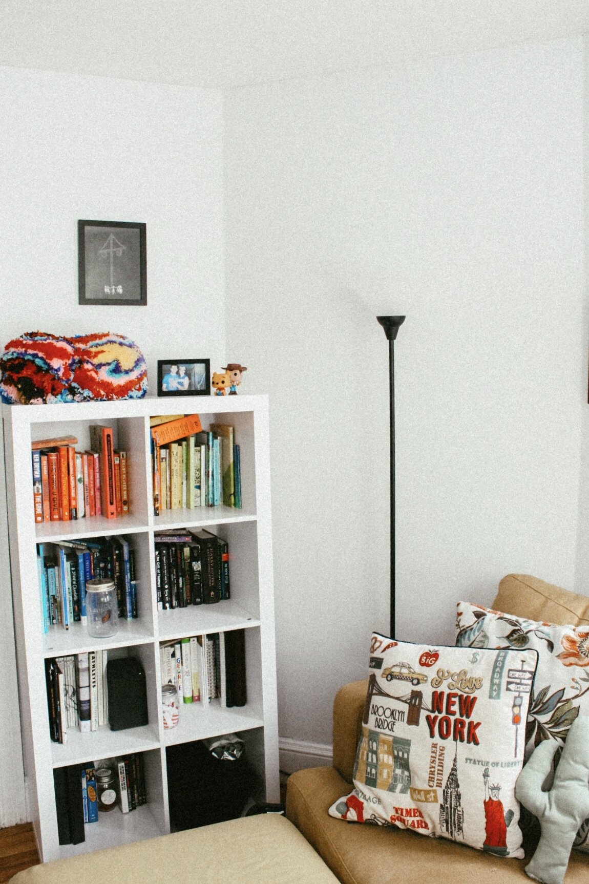
We had two cube bookshelves, one that is white and that we always kept books in and one that is black that we have always stored KC’s records in. We decided to keep it the same and have the books in the white bookshelf and records in the black book shelves because it has always been that way. We turned the bookshelf vertical instead of how we normally had it and color organized the books. Organizing by color was literally the greatest thing that I could have done because it made it look very visually appealing and it helps me more to know where things are. We put it next to the couch because I prefer to read on the couch and wanted the ability to have them close by and readily available. It also seemed like a central location in the apartment which was also important to us.
We wanted to create an “entertainment center” in the house because we have so much entertainment related things, especially with music. We have a record player, a cassette player and an eight track player which all needed a spot. We kept the black bookshelf and turned it horizontal to create a TV stand and filled the bookshelf with records. Originally the TV was supposed to go on the wall, but when I made the shelves we ran into a little mishap and so we needed a new place to put the TV. We used the book shelf as a TV stand. It worked perfectly to hide most of the wires and makes it look clean and nice. Just so you know, I really hate wires, I don't know why, they just upset me and make me think of teenage boys' rooms that were always messy.
THE ENTERTAINMENT CENTER
The real main focus of this room is that entertainment center that we created for all of our electronics. I stated that we used the bookshelves to create the TV stand, but I also made a table for the record player. I actually made it because it was absolutely a necessity. Having a record player means that you need a receiver as well and these take up a lot of space! We also have a cassette player that doubles as a radio that also needed to be connected to the receiver so they all need to live basically in the same home. When we moved into this apartment, there were a few furniture items in a closet and one of them was a BESTA table from Ikea. It was the perfect size for all of the electronics so I took it apart to get the back panel out and have an open back and added some hairpin legs to the bottom. It added that perfect modern look to the living room and the perfect home for the record player.
When you have as much electronics as we do, that also means A LOT of wires, I was pretty upset by these because I really had no idea what to do with them and how to make them disappear. Thankfully a quick google search led me to these wire boxes that hide all your wires. This really changed the game and did not affect the wires at all, which was a concern of ours.
Another fun part of having a record player and receiver from the 90s is the speakers that they come with. They are called bookshelf speakers and they are pretty large. In the past we had put them on tables and such but they need to be close to the receiver because they are all connected and that is when we came up with the idea to get stands, giving the speakers a permanent home and also have them lifted enough where the sound is really amazing quality. They were also pretty easy to put together, KC put them together alone in about a half hour.
DECORATING
Like I said earlier, for decorating I gave KC pretty much full design control, but I also had a lot of input. To start I already knew before we moved in what rug I wanted so I made that happen and ordered it from RUGS.com. This rug just gives me comfort vibes and every time I look at it I just want to lay on it and roll around on it. It is crazy to think that, because of how hard I work to keep this rug perfectly clean I do not really let myself roll around on it. It is just so amazing, I do not want anything to happen to it!
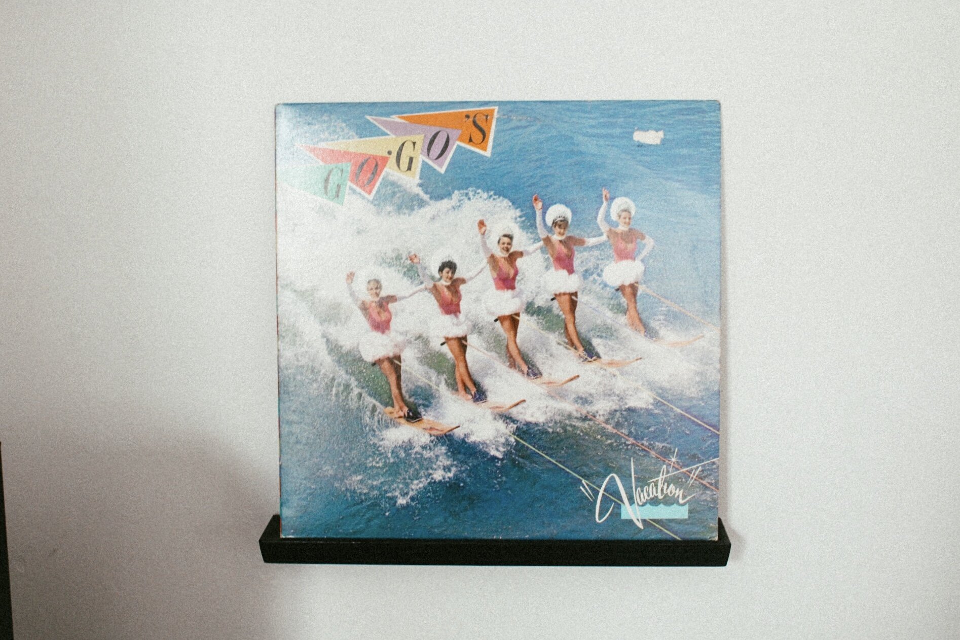
KC had a whole design plan of getting prints that represented the four corners. He got the prints from Urban Outfitters and they are unbelievably stunning and they fit the vibe of the space so well. I ordered some black frames from Target and it made it so much more amazing. He also snagged this large print of a caravan that tied them all together. It is like this space is all about going on a road trip!! We always have music of some sort playing, so it totally makes sense. We also got a record holder to put above the record player that way KC can show off what record he is playing. It is something we have always wanted, but never had the space for so it was important for us to have it.
When it came to hanging everything up, this is where a lot of my input came into play. I have been looking at a lot of influencers on social media this quarantine and most of them have The Frame TV from Samsung. It is a basic TV but it is framed out and looks like a photo hanging on the wall. A lot of people make gallery walls around their Frames and I really liked that. We already have a TV that we love a lot so I wanted to hang a gallery wall around the TV that way we could give the illusion of it being a photo but at the same time to fill the dead space around the TV that I personally feel always exists. We chose two of the four corners and hung them above the TV. We hung the record holder above the record player and the caravan poster above that. I then added some small frames to the side, above one of the speakers to just make a full gallery wall. On the walls aside the TV is where we put our favorite posters. One is from Bonnaroo 2014 and the other is from a Urban Outfitters event in Cambridge that we attended when we first moved here!
Above the TV we hung the shelf that I made and decorated that with houses that either I have made or have been gifted to me. I have an obsession with houses and even have a house tattoo! We also put the Little Green Guys from Toy Story on the shelf, actually they are all over the apartment!
We then had to decorate above the couch and that was very easy, we just put the other two of the four corners and hung them perfectly above the couch. There was some dead space on the wall and it was mainly because we did not know how to hang something with the lamp in the way. This took a lot of planning. I tried to hang a weaving higher than the lamp, I tried to hang a flag/ tapestry behind the lamp, but I did not like any of it! The lamp makes things difficult so we are still trying to figure it out. We are thinking of maybe leaving it blank, but also maybe adding some wall decals. We lastly hung up a print from a local artist called Death of Seasons and it is a small black print with a scene from the movie Midsommer which is one of my favorite scary movies made in a long time. Can’t forget about Giant Pom, one of the greatest accomplishments of my fiber arts career. I made him at work with a handful of clients and love that he now lives in my home. We are also thinking of adding some weavings behind the couch and above the prints, but I just still have to make them.
I so badly wanted this space to be the most comforting and most loved space in the home because I knew that it would be the most used. In this whole apartment I wanted it to be a mix of my style and KCs style and I feel as though this space really marries our design inspiration perfectly. I am excited to LIVE in this space for honestly the rest of forever, if that is allowed. I love how everything came together and how it really feels like us.
FURNITURE SOURCES
IKEA OTTOMAN | TARGET OTTOMAN | CUBE STORAGE BLACK | CUBE STORAGE WHITE | BESTA TABLE | BASKETS IN TABLE | TABLE LEGS | SPEAKER STANDS
WALL DECOR + ART SOURCES
Gallery Wall: VAN IN ROCKS by Kevin Russ | OCEAN by Leah Flores | VAN ON ROAD by Kevin Russ | WHAT NOW from Steal Like An Artist By Austin Kelon | HOW? CAN YOU GROW MORE by Me | RECORD SHELF | CACTUS by Me
FRAMES FROM TARGET and AMAZON | MIDSOMMER PRINT by Death of Seasons| WILDFLOWER PRINT by Hilary Murphy | DESERT PRINT by Kevin Russ | FLAMINGO CACTUS HOLDER
DECOR SOURCES
HEART SHAPED PILLOW | SUN PILLOW (they don’t have the one I have anymore so here’s another fave) | YELLOW SQUARE PILLOW | RUG | LAMP (spray painted matte black) | WIRE HIDER


